The design that started it all. Zeitgeist 1.0:

We first tried to create a coherent color scheme with Zeitgeist 2.0:

This next one is a misguided version that did not last very long. The scattered words ended up being a bit too flashy and distracting. The one displayed here is actually a 4-color, never-before-seen version of the one we posted on the website. I give you Zeitgeist 3.0 (unreleased multicolored edition):

We did much better in the next evolution. This marked the first instance of the ever-popular "Global Zeitgeist." Zeitgeist 4.0:

When we decided to pursue our new collaborative model, we also decided to start actively using zzzeitgeist in lieu of Zeitgeist. While we re-cut the banner to reflect this, we had a no-frills temporary placeholder, zzzeitgeist 1.0:

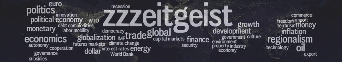
... Which paved the way for the rebirth of global zzzeitgeist, modeled after Zeitgeist 4.0, our most popular banner. zzzeitgeist 2.0 (current):

What will the future hold? And which one is your favorite?

We did much better in the next evolution. This marked the first instance of the ever-popular "Global Zeitgeist." Zeitgeist 4.0:
When we decided to pursue our new collaborative model, we also decided to start actively using zzzeitgeist in lieu of Zeitgeist. While we re-cut the banner to reflect this, we had a no-frills temporary placeholder, zzzeitgeist 1.0:

... Which paved the way for the rebirth of global zzzeitgeist, modeled after Zeitgeist 4.0, our most popular banner. zzzeitgeist 2.0 (current):

What will the future hold? And which one is your favorite?


No comments:
Post a Comment